Lesson 5: Organizing and Visualizing Data
This lesson focuses on organizing and displaying data in tabular and graphical forms. Organizing and visualizing data helps us gain insight and draw meaningful conclusions. Numerical and categorical data can be organized into meaningful forms using summary tables (such as frequency tables) and visualizations (such as histograms and bar charts). Frequency tables allow us to represent the frequency distribution of data in a tabular form. Frequency tables are also helpful for creating graphs that display data distribution.
Why Organize or Visualize Data
Organizing and visualizing data makes it easy to see the pattern in the data. A frequency table contains distinct categorical data values, numerical data values, or ranges of numerical data values; and their corresponding frequencies, relative frequencies, or percentage frequencies.
Definition of Terms
- The frequency of a data value is the number of times the data value occurs in a set of data.
- The relative frequency of a data value is the proportion of the data value in a dataset expressed as a fraction or decimal. Hence relative frequency of a value can be interpreted as the probability of observing that data value.
- The percentage frequency of a data value is the relative frequency of that value expressed in percent. It is calculated by multiplying the relative frequency of the data value by 100%.
- The cumulative frequency at a numerical value of interest is the sum of the frequency of that value and the frequencies of all the sorted data values below the value of interest.
Organizing Categorical Data Using Frequency Tables
Categorical data could be nominal or ordinal. Since mathematical operations such as addition, subtraction, multiplication, and division cannot be meaningfully applied to categorical data, statistical measures computed by applying mathematical operations to data cannot be used for categorical data. For example, mean, variance, skewness, and so on are calculated using mathematical operations on the data. So, it does not make sense to compute such statistics for categorical data. However, mode can be found for categorical data.
The median can be computed for ordinal (categorical) data but not for nominal (categorical) data. Frequency tables are commonly used to organize and display categorical data. A frequency table for categorical data is a table that contains unique categories of the categorical variable of interest and the corresponding frequencies, relative frequencies, or percentage frequencies of the categories.
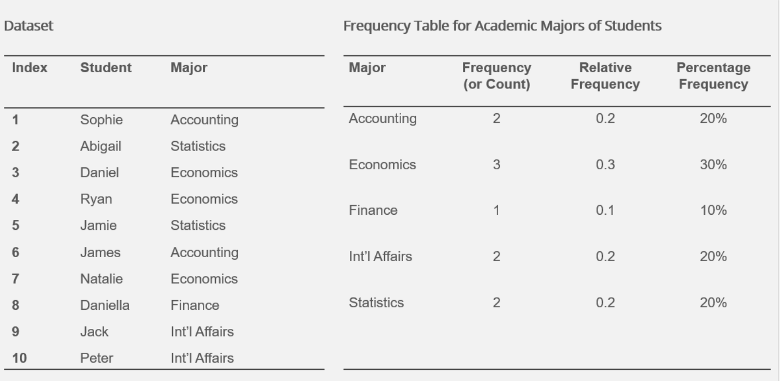
Frequency Table for Categorical Data
An Example of a Frequency Table for Categorical Data
Organizing Qualitative Data Using Contingency Tables
A contingency table is a two-way table used to display the joint frequencies of the unique values of variables. Organizing information using a contingency table makes more sense when categorical variables are used. Contingency tables are helpful in several ways:
- Contingency tables allow us to understand the relationship between categorical variables. For example, contingency tables are used in chi-squared tests to investigate whether two categorical variables of interest are related.
- Contingency tables allow us to display the joint frequencies of distinct values of categorical variables.
- Moreover, the contingency table frequencies help calculate joint, marginal, and conditional probabilities.
A Contingency Table Showing the Relationship between Ethnicity and Gender
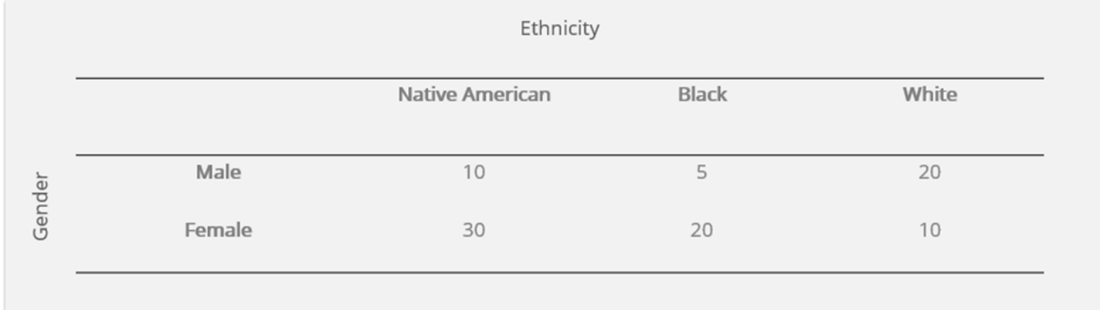
The contingency table shows the number of individuals in groups based on a combination of gender and ethnicity characteristics or levels. Each cell in a contingency table represents a group, and the cell frequency represents the size of the group. For example, the Nave American Male group comprises 10 individuals.
Organizing Numerical Data Using Frequency Tables
Numerical data can be classified into discrete and continuous. Discrete data is numerical data on a variable that takes only a finite or countable number of distinct values within a given range of possible values. In contrast, continuous data is numerical data on a variable that can take infinite values within a specific range.
Frequency tables with grouped or ungrouped data can be constructed using numerical data values (discrete or continuous). A frequency table with ungrouped data contains data value and their corresponding frequencies. On the other hand, a frequency table with grouped data contains distinct classes, bins, or ranges and their corresponding frequencies of the classes. The frequency of a class is the number of data points classified into that class.
Constructing frequency tables with ungrouped data makes more sense when the data is discrete, and the data distribution has a smaller range. Frequency tables with grouped data are more meaningful when the raw data is discrete and has a distribution with an extensive range or when the data is continuous.
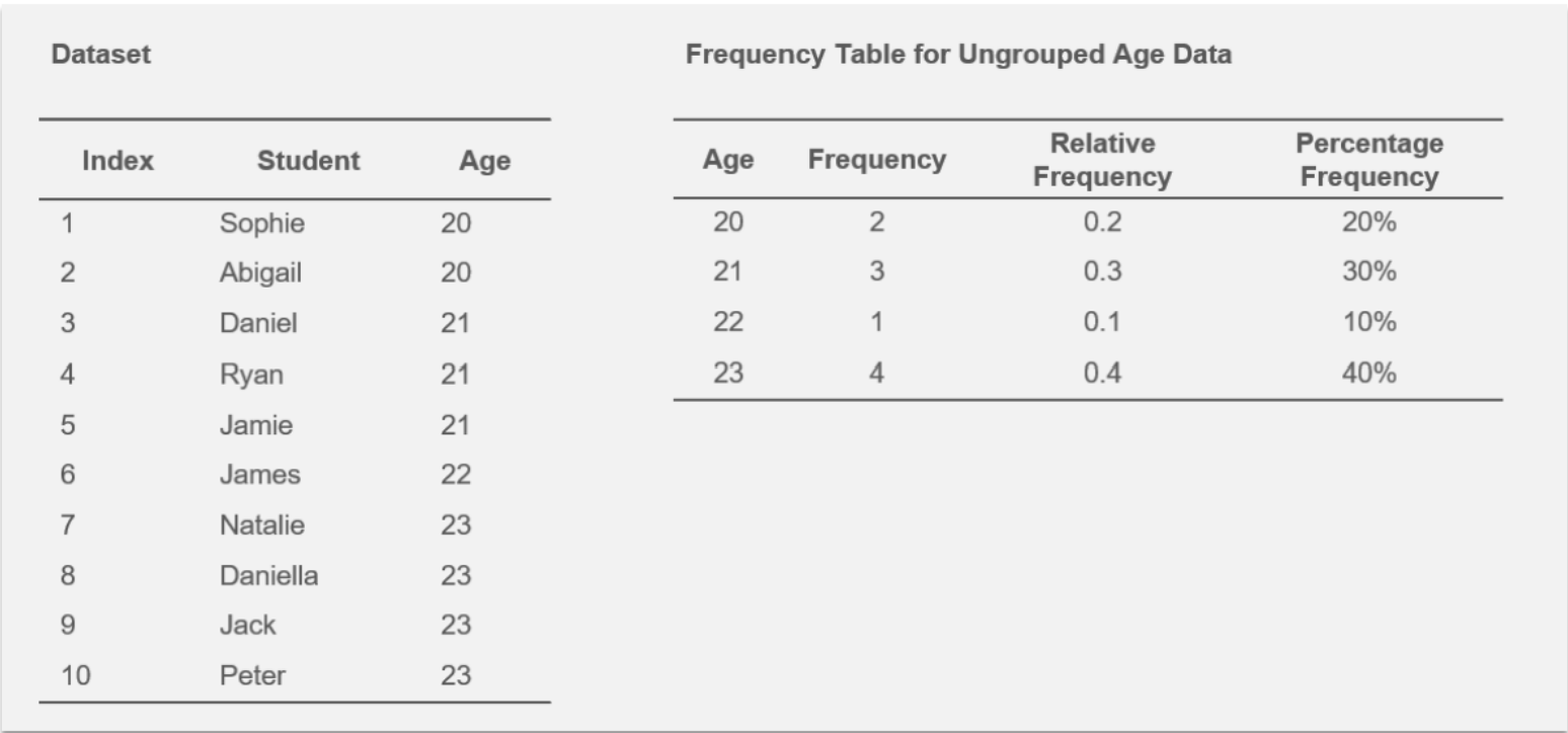
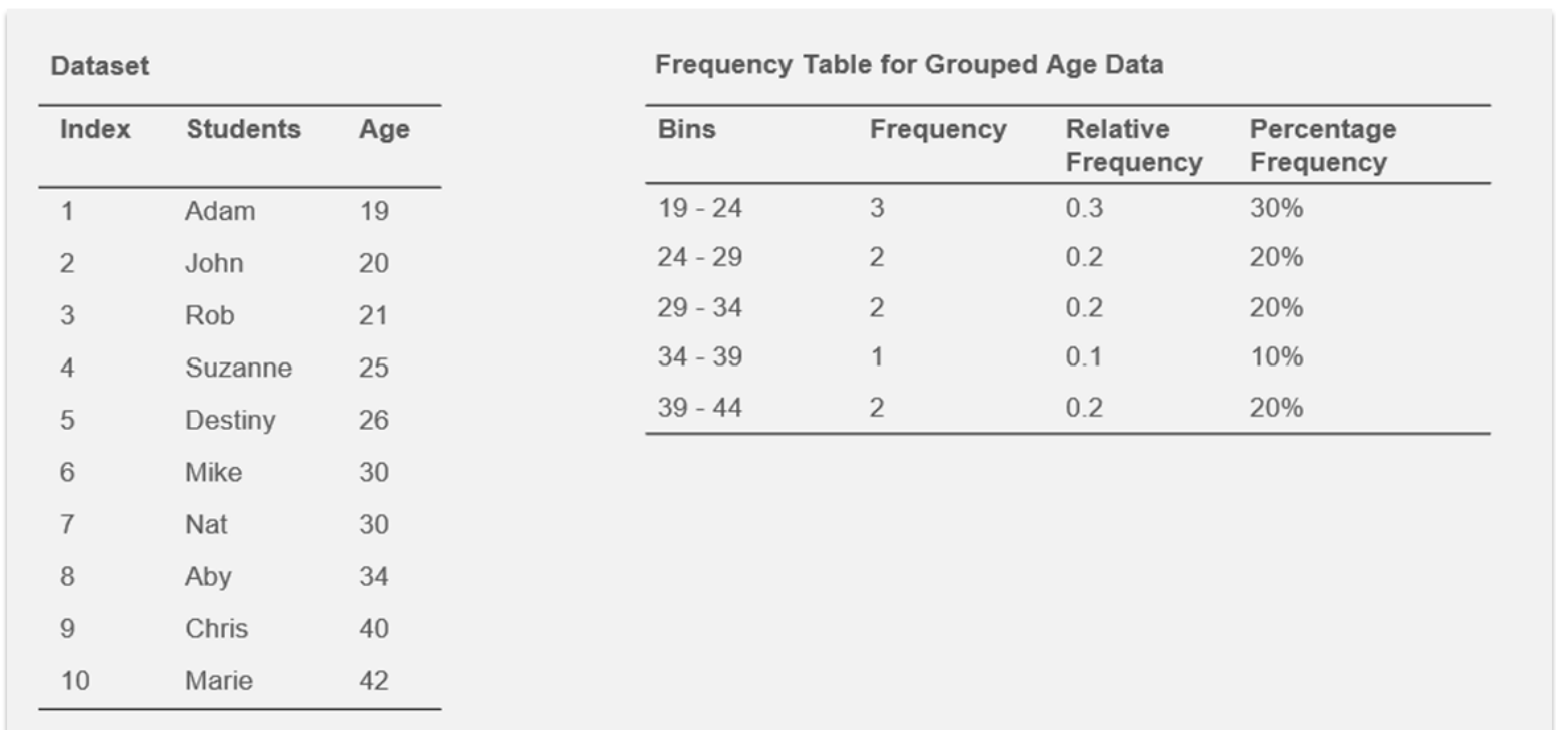
Frequency Table with Ungrouped Data
An Example of a Frequency Table with Ungrouped Data
Frequency Table with Grouped Data
An Example of a Frequency Table with Ungrouped Data
The following steps are used to group numerical data into classes or bins:
- Determine the maximum and minimum data values in the data distribution.
- Determine the number of non-overlapping classes or bins that will be used to group the data.
- Generally, 5 to 20 bins are recommended, and more bins should be specified for larger samples. In practice, the number of bins is determined by trial and error. That is, different numbers of bins could be defined. Then, the number of bins that result in more meaningful bin frequencies is selected.
- Determine the bin width as (maximum data value – minimum data value)/number of bins. The bin width can be rounded up to a more convenient value.
- Determine each bin’s lower and upper bin limits such that each data value can be classified into one and only one bin. That means, for each bin, one of the bin limits needs to be exclusive while the other is inclusive. If we make the lower limits inclusive, we can set the data distribution’s minimum value as the first bin’s lower limit. Then, add the calculated bin width to the first bin’s lower limit to get the first bin’s exclusive upper limit.
- Any bin’s exclusive upper limit is the next bin’s inclusive lower limit. Keep adding the bin width to the bin limits until all the data range is covered.
For the grouped data above, the minimum data value in the raw data is 19, and the maximum value is 42. The desired number of classes is 5, so the bin width is calculated as (42-19)/5 = 4.6 ≈ 5. The lower limit of the first bin is set to 19, and the bin width, 5, is added to get the upper bin limit. The addition process is repeated to get the rest of the bin limits. So the bin limits are 19, 24, 29, 34, 39, 44. In real life, analytical or statistical software generates frequency tables. Still, it is crucial to understand what is happening under the hood when software is used to generate statistical results.
Visualizing Categorical Data
Bar charts or graphs are commonly used to visualize the frequency distribution of categorical data on a variable of interest. A bar chart is a visual or graphical display of distinct values of a categorical variable and their frequencies. A bar graph can be easily constructed from a frequency table or frequency distribution of categorical data.
A Bar Chart Showing the Distribution of Academic Majors of Students 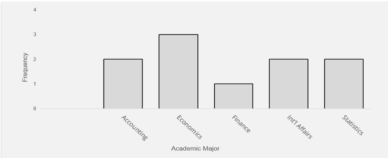
Visualizing Numerical Data
Histogram
The distribution of numerical data can be easily visualized through a histogram. A histogram is a graphical representation of the distinct classes or ranges of numerical data (grouped) and the frequencies of the classes. The frequency of a class is the number of data values within the class or bin.
A Histogram Representing the Distribution of Ages of Students 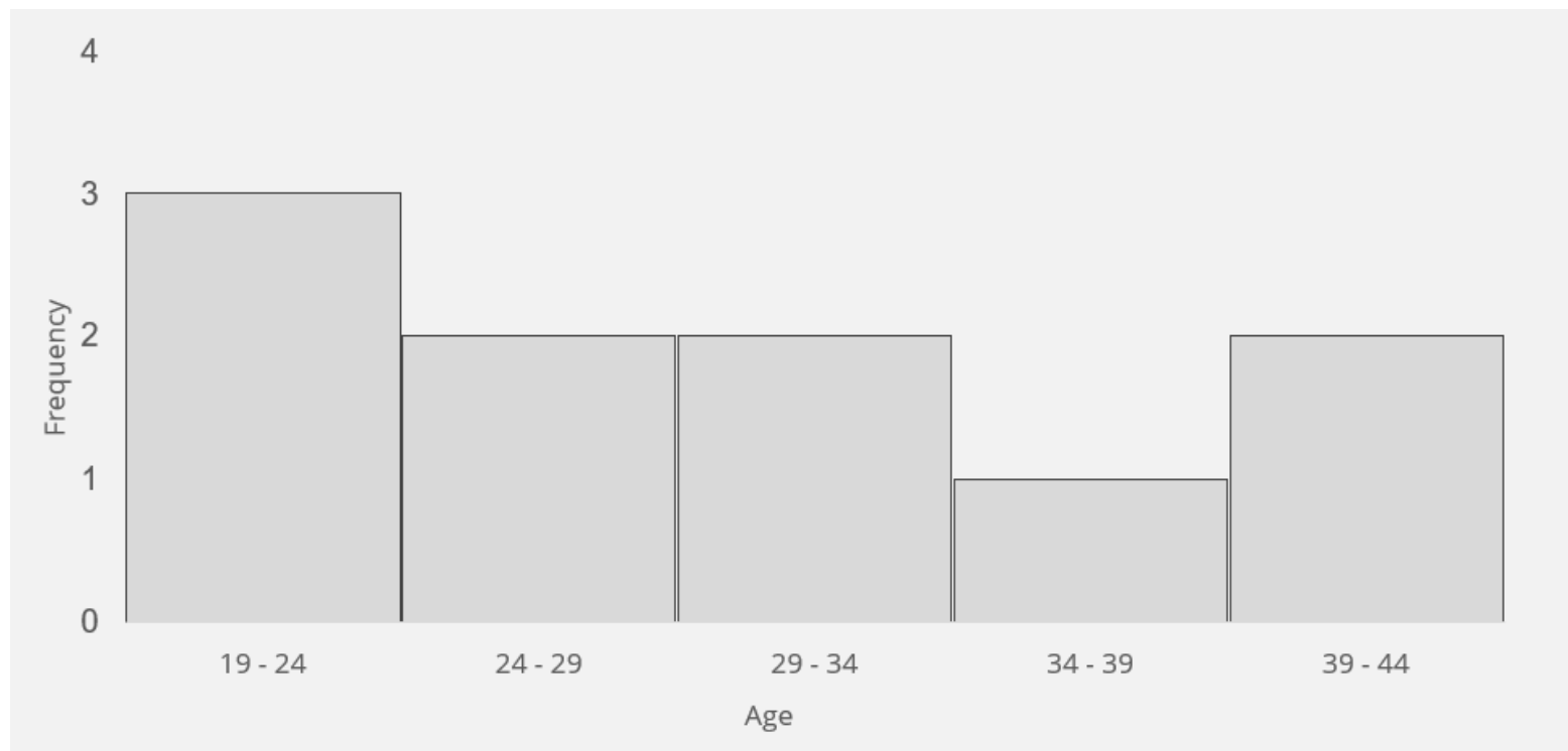
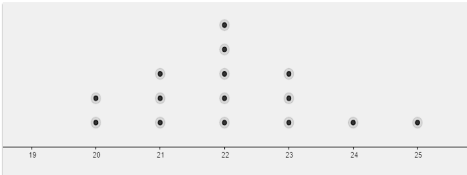
Dot Plot
A dot plot is a visual display of a variable’s unique values and their their corresponding frequencies using dots. Dot plots are great for representing the distribution of ungrouped discrete data where the range of the distribution is not too large. The number of dots on a data value represents the frequency of the data value. Note that a dot plot can be constructed for categorical data as well. Given the following age data: 20, 20, 21, 21, 21, 22, 22, 22, 22, 22, 23, 23, 23, 24, 25; the dot plot of the data distribution can be constructed as shown below.
A Dot Plot of Age Distribution
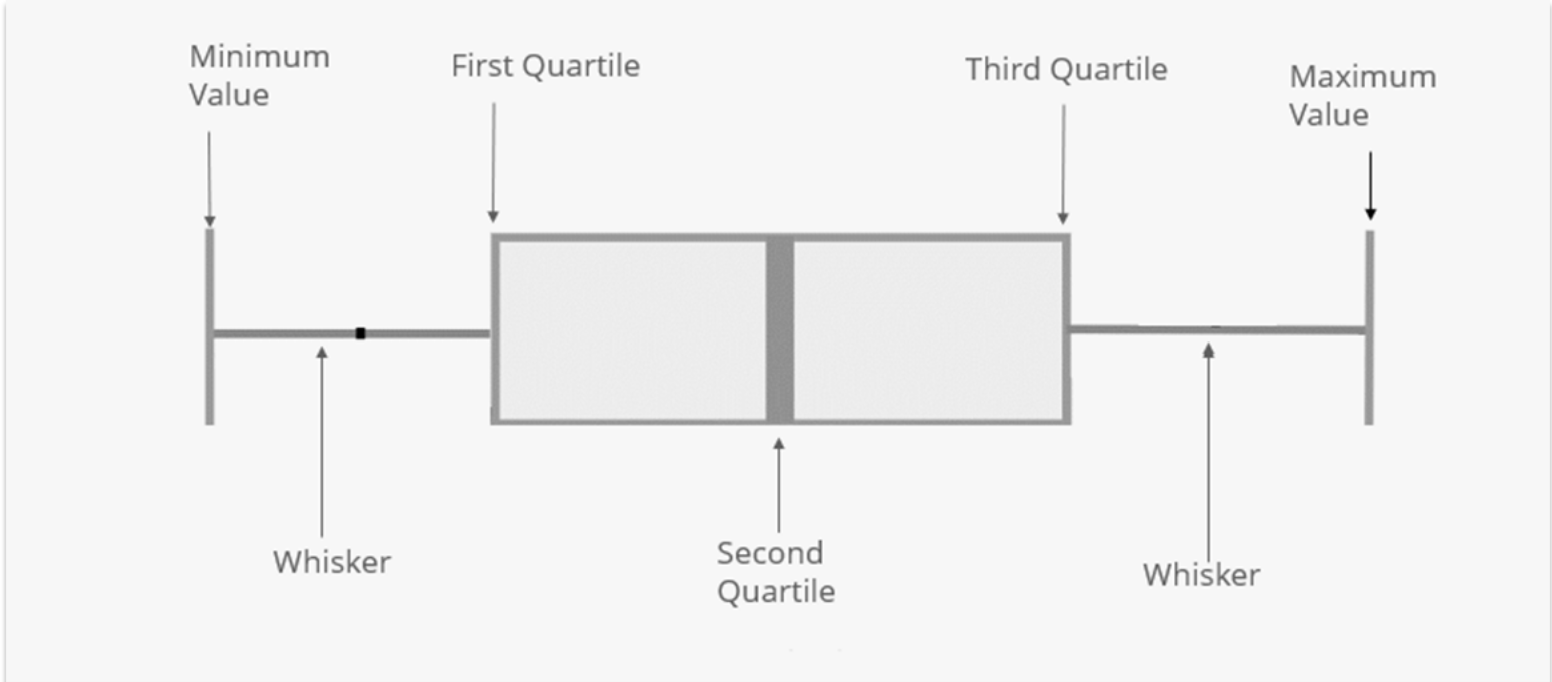
Box Plot
A box plot is a five-summary plot representing a data distribution. The five-summary statistics displayed on the box plot include the minimum value, first quartile (Q1), second quartile (Q2) or median, third quartile (Q3), and maximum value of the data distribution. The various components of a box plot are illustrated in this diagram below.
A Diagram of a Box Plot
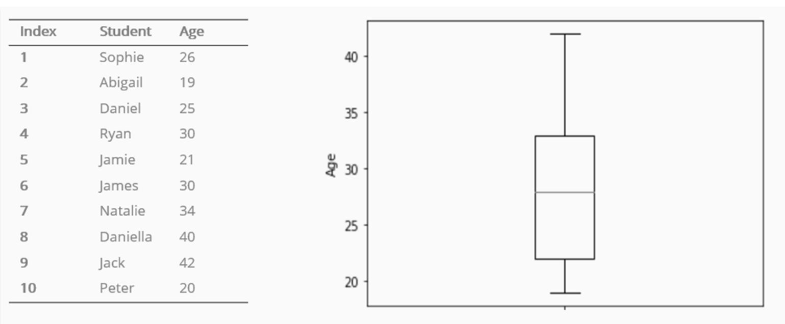
An Example of a Box Plot Showing the Distribution of Ages
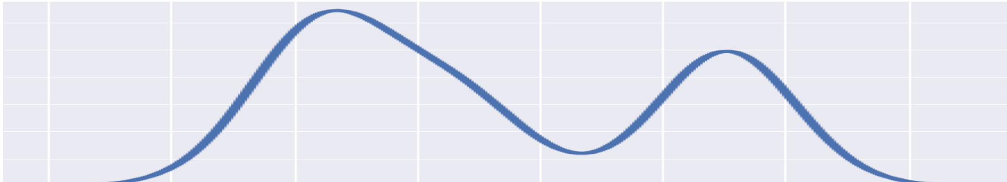
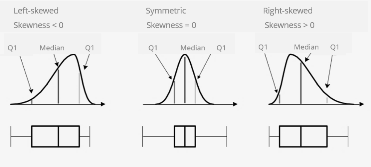
Like histograms, box plots are used to visually inspect the normality of a data distribution. When the two whiskers of the box plot have approximately the same length, the data represented by the box plot is normally distributed. If one whisker is shorter than the other, the data distribution is skewed.
How Box Plots Compare to Normal Curves
Scatter Plot
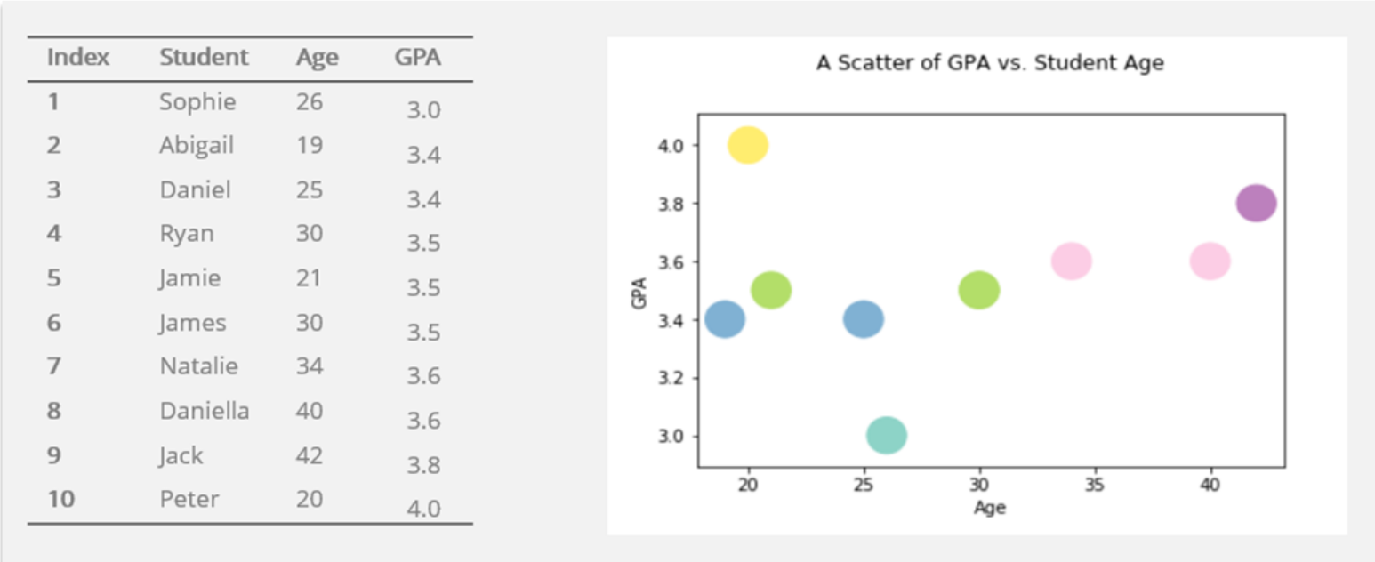
A scatter plot is a graph representing the relationship between two numerical variables. A scatter plot consists of x-axis, y-axis, and dots on the graph representing data values of observational units. The axes represent the variables, and the points plotted on the graph represent observational units with specific values for the variables. A scatter plot could be used to visualize the strength of the relationship between two variables.
A Scatter Plot Showing the Relationship between GPA and Student Age
In a nutshell, organizing and visualizing data allow us to quickly gain insight into our data and help us to communicate the results of data analysis in ways that are easy to understand.