Lesson 4: Describing and Summarizing Data
Why Data Summaries?
Data analysis aims to extract meaning from data: one way to glean insight from data is by describing the data using data summaries. Data summaries are compact, high-level numerical or visual representations of data. This lesson will focus on using numerical measures to summarize data.
Why is it important to present data summaries instead of presenting all the observations or data points? If you wanted to describe a missing cat, would you describe every cell and chromosome in the cat, or would you instead use high-level intuitive characteristics of the cat such as the color, breed, length of hair, eye color, gender, ear, nose, and behavior of the cat? Obviously, people will understand how the cat looks like when we use more high-level characteristics of the cat instead of granular and cellular details. Just as cats have characteristics that allow us to understand and distinguish between different cats, datasets also have characteristics that would enable us to describe and understand the data.
Suppose you were trying to gain admission into a graduate program at a university. You contacted the Admissions Officer to understand the requirements for admission into the program and found that you would need to submit GRE scores as part of the admission requirement. However, there is no cutoff GRE score requirement for this graduate program. You wanted to get an idea about the GRE scores of students who have been admitted into the program, so you requested information about the GRE scores of admitted students.
Would you prefer to be presented with the GRE scores of one thousand students admitted into the program, or would you like to be provided with the mean, median, minimum value, maximum value, and standard deviation of the GRE scores of admitted students? You probably do not want to heat your brain going through one thousand scores to understand the typical GRE score of a student who gets accepted into the program.
The mean, median, minimum value, maximum value, and standard deviation of the GRE scores of admitted students are summary statistics, descriptive statistics or data summaries describing the GRE scores of admitted students. Summary statistics on the GRE scores provide quick and easy-to-understand information about the GRE scores. So, describing data allows us to condense many observations into summary statistics or statistical measures that represent the data meaningfully. Various statistical measures are used to describe numerical and categorical data.
Descriptive or Summary Statistics
Numerical measures used for summarizing quantitative data can be divided into:
- Measures of central tendency or measures of location (mean, median, mode)
- Measures of variability (variance, standard deviation, range, and interquartile range)
- Measures of shape (skewness and kurtosis)
The numerical measure usually used for describing categorical data is frequency or count.
Data Distribution
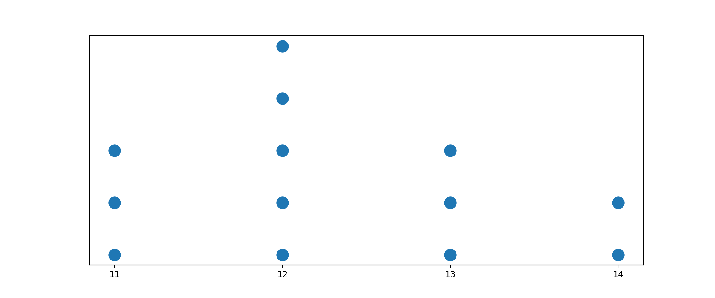
A data distribution is the distribution of all the data values on a variable of interest. The data values are usually sorted from the smallest to the largest. An example of a data distribution is 11, 11, 11, 12, 12, 12, 12, 12, 13, 13, 13, and 14. Statistical measures describe the data distribution’s center, variability, and shape. That is, central location, variability, and shape the three main characteristics that can be used to summarize data.
Visualizing a Data Distribution
There are several ways to visualize a data distribution. A data distribution can be represented as the relationship between data values and how frequently each value occurs. It is easy to visualize the distribution of data using a dot plot as follows (note that the next lesson goes deeper into data visualization):
Measures of Central Tendency or Location
If you were provided with daily sales revenue data for a specific product for last month, what is the sales value at the center of the daily sales data? The center of the data could be defined in several ways. Central tendency is the center or central location of a data distribution are commonly measured using mean, median, and mode.
Mean
There are different types of means including arithmetic mean, geometric mean, and weighted mean. Arithmetic mean, usually called mean or average, measures the center of the data distribution for a quantitative variables. The mean of a quantitative variable is the sum of all the values measured on that variable divided by the number of values. The sample mean is computed using all the observations or data values for the variable of interest in the sample. In contrast, the population mean is calculated using all the observations in the population.
Sample Mean: Formula
The formula for sample mean of n data points in the sample is (where \(x_{i}\) = the ith data value): \[\sum_{i=1}^{n} x_{i} = \frac{x_{1} + x_{2} + \cdots + x_{n}}{n}\]
Population Mean: Formula
The formula for population mean of N data points in the population is (where \(x_{i}\) = the ith data value): \[\sum_{i=1}^{N} x_{i} = \frac{x_{1} + x_{2} + \cdots + x_{N}}{N}\]
Mean: Solved Example
Given the following sample salary data (in dollars): 80,000, 60,000, 90,000, 80,000, 70,000; what is the average income? There are five salary data points, and the sum of the salaries is 380,000. So, the mean of the salary data would be 380,000/5 = 76,000.
Weight Mean
Weighted mean is a convenient way of computing arithmetic mean when several observations repeatedly occur in the data. Weighted mean is sum of the product of the values and their frequencies. Weighted Mean is the same as the sum of weighted values. The weights applied to the unique values are the relative frequencies or proportions of the values.
Weighted Mean: Formula
The formula for weighted mean of k unique data points in the sample is (where \(x_{i}\) = the ith unique data value): \[\sum_{i=1}^{k} x_{i}p_{i} = {x_{1}p_{1} + x_{2}p_{2} + \cdots + x_{k}p_{k}}\]
Weighted Mean: Solved Example
Given the data: 2, 2, 2, 2, 2, 10, 10, 30, 30 and 30. The unique values in the data and their proportions are as follows:
| Value | Proportion | |
|---|---|---|
| 2 | 0.5 | |
| 10 | 0.2 | |
| 30 | 0.3 |
The weighted mean of the data can then be calculated as follows:
Weighted Mean = 2(0.5) + 10(0.2) + 30(0.3) = 1 + 2 + 9 = 12
Weighted Mean: Exercise
A product is sold at three different prices based on the quantity demanded. The unit price for the produce is $2, $5, or $8 if 100, 30, or 10 products are demanded, respectively. What is the average price of the product? You could use weighted mean to solve this problem where the various prices are the unique values. The demand (quantities) for the various unit prices can be used to compute the weights.
Geometric Mean
The geometric mean is the nth root of the product of “n” values. Geometric means are beneficial in finding the average percentages, ratios, or growth rates over time. The geometric mean of “n” values is given by:
\[\sqrt[n]{\prod_{i = 1}^{n}x_{i}} = \sqrt[n]{x_{1} x_{2}\cdots x_{n}}\]
Geometric Mean: Exercise
The open stock prices of a company for four successive days are 200, 204, 210, and 215. Calculate the daily percentage change in stock prices. Using the calculated daily percentage change in the stock prices, compute the average percentage change in stock prices (using the geometric formula).
Note that percentage change is computed as: \[ Percentage_{change} = \frac{current_{value} – previous_{value}}{previous_{value}}\]. That implies each day’s percentage change in stock price would be calculated as follows:
\[Price_{change} = \frac{price_{today} – price_{yesterday}}{price_{yersterday}}\].
Median
The median is the middle value or midpoint of sorted data. When the number of data points on a variable is odd, the midpoint (median) of the data distribution is the \(\frac{n+1}{2}\) th term of the sorted data. For example, given the sorted data 2, 4, and 6, the median is 4.
When the number of data points in the sorted data is even, the median is computed by averaging the two values in the middle. That is, the median would be the average of the \(\frac{n}{2}\) th term and the \(\frac{n+1}{2}\) th term. Given the sorted data 2, 4, 6, and 8, the median of this data distribution can be calculated as \(\frac{4+6}{2}=5\).
Mode
Mode is the data value in a data distribution with the highest frequency. Suppose students’ math scores in a class are 80, 80, 85, 85, 85, 89, and 90. The mode of the math scores would be 85 since this value has the highest frequency in the data distribution.
Comparing the Measures of Central Tendency
Mean is the most commonly used measure of the central location of a data distribution. However, the mean may not be a good measure of center when the data distribution is skewed or when the data distribution has an outlier. If the data distribution is skewed or has an outlier, it is preferable to use the median instead of the mean to measure the center of the data distribution.
Also, the mean is more appropriate for interval and ratio data, the median is for ordinal, interval, and ratio data, and the mode is for nominal, ordinal, interval, and ratio data. For numeric data, mean and median are primarily used to measure the center of the data. Mode is not a very reliable measure of center because a data distribution may have more than one mode (bimodal or multimodal).
Measures of Variability
Variability is the measure of the spread or dispersion of a data distribution. Why is it essential to understand variability? Variability tells us how closely clustered the data points are around the mean of the data distribution. A small variability indicates that most data points are closer to the mean. A small variability shows that the mean represents the data well. If the variability is large, the mean does not represent all the data well.
Variability is useful for comparing two data distributions with similar mean values. Two distributions are considered identical if they both have similar mean values as well as similar values for variability. There are several measures of variability, including variance, standard deviation, range, and interquartile range.
Variance
Variance is the average squared deviation of the data points from the mean. A deviation, \(x_{i} - \bar{x}\) is the distance between a data point and the mean of the data distribution. Squared deviations instead of deviations are used to compute variance. This is because the sum of the deviations of data points from the mean will always give zero as the total of positive deviations always cancel out the total of negative deviations. For this reason, in calculating variance, each deviation is squared to eliminate the negative deviations. As such, the sum of the squared deviations should not always produce zero unless all the data values used are the same or do not vary.
The mathematical formula for sample variance is: \[s^{2} = \frac{\sum\limits_{i=1}^{n} \left(x_{i} - \bar{x}\right)^{2}} {n-1}\] The mathematical formula for population variance is: \[\sigma^{2} = \frac{\sum\limits_{i=1}^{n} \left(x_{i} - \mu\right)^{2}} {N}\] The terms in the variance formulas are defined as follows:
- \(s^{2}=\text{sample variance}\)
- \(\sigma^{2}=\text{population variance}\)
- \(x_{i}=\text{the ith data point}\)
- \(\bar{x}=\text{the mean of the sample data}\)
- \(\mu=\text{the mean of the population data}\)
- \({n}=\text{sanple size or number of data points in the sample}\)
- \({N}=\text{population size or number of data points in the population}\)
Deviation
The deviation,\(x_{i} - \bar{x}\) of a score from the mean can be interpreted as the distance of the score below or above the mean. Negative deviations indicate the distance of a score below the mean. Positive deviations indicate the distance of the score above the mean. The deviation of a score from the mean can also be interpreted as the amount of prediction error. Note that the mean can be viewed as the predicted score for all the scores in the data distribution.
Standard Deviations
Standard deviation is the square root of variance. Standard deviation is usually preferred than variance because the standard deviation is more interpretable than the variance since standard deviation and the data have the same unit.
The mathematical formula for sample standard deviation is: \[s = \sqrt{\frac{\sum\limits_{i=1}^{n} \left(x_{i} - \bar{x}\right)^{2}} {n-1}}\] The mathematical formula for population standard deviation is: \[\sigma = \sqrt{\frac{\sum\limits_{i=1}^{n} \left(x_{i} - \bar{x}\right)^{2}} {N}}\]
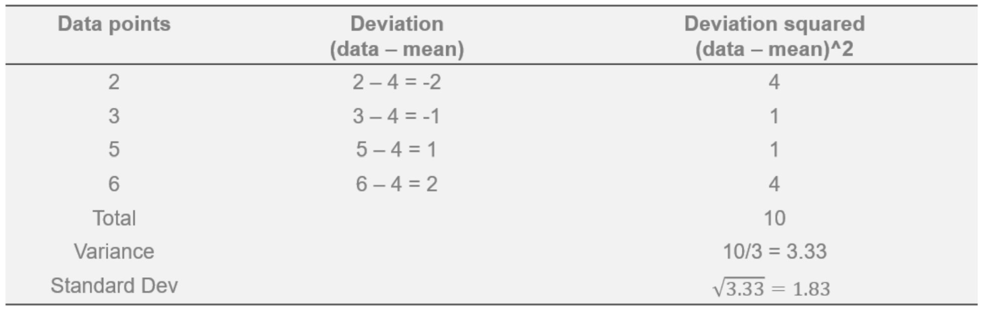
Variance and Standard Deviation: Example
Given a sample of data values 2, 3, 5, and 6, the variance and standard deviation can be calculated as follows:
Range
The range is the difference between the maximum and minimum values in the data distribution. \[Range = \text{maximum value} – \text{minimum value}\]
Interquartile Range
Interquartile range (IQR) is the difference between the data distribution’s third quartile (Q3) and the first quartile (Q1). The first, second, and third quartiles are obtained by sorting the data and dividing the data into four equal parts, each containing 25% percent of all the data points.
The formula for the Interquartile Range is:
\[IQR = Q3 – Q1\]
First Quartile
The first quartile (Q1) is the value below which 25% of the sorted data falls. The first quartile is also called the 25th percentile.
Second Quartile
The second quartile (Q2) is the value below which 50 percent of the sorted data falls. The second quartile is the median, also called the 50% percentile.
Third Quartile
The third quartile (Q3) is the value below which 75% of the sorted data falls. The third quartile is also called the 75% percentile.
Comparing the Measures of Variability
The standard deviation is the most widely used measure of variability. One of the significant reasons the standard deviation is preferred instead of variance is that the standard deviation is more straightforward to interpret than variance. Variance is calculated using the squared deviations from the mean, so the unit of variance is the square of the unit of the data.
Squared units are challenging to interpret. For example, if you were given income data where income is measured in dollars, the unit of variance for the income data would be “squared dollar.” What a squared dollar represents is not intuitive. Standard deviation is the square root of the variance. Hence, standard deviation eliminates the problem of having squared units.
Therefore, the unit of standard deviation is the same as the unit of the data used, which makes the standard deviation easier to interpret. Standard deviation can be loosely interpreted as the typical deviation of a data value in a distribution from the mean. The range and interquartile range are based only on two values, but the variance and standard deviation consider all the values in the data distribution.
Measures of Shape
The shape of a data distribution is based on the data values present in the distribution and how frequently each value occurs. Let’s consider the following data distribution: 9, 10, 10, 11, 11, 11, 12, 12, 12, 12, 12, 13, 13, 13, 14, 14, and 15. This distribution can be graphically represented using a histogram as follows:
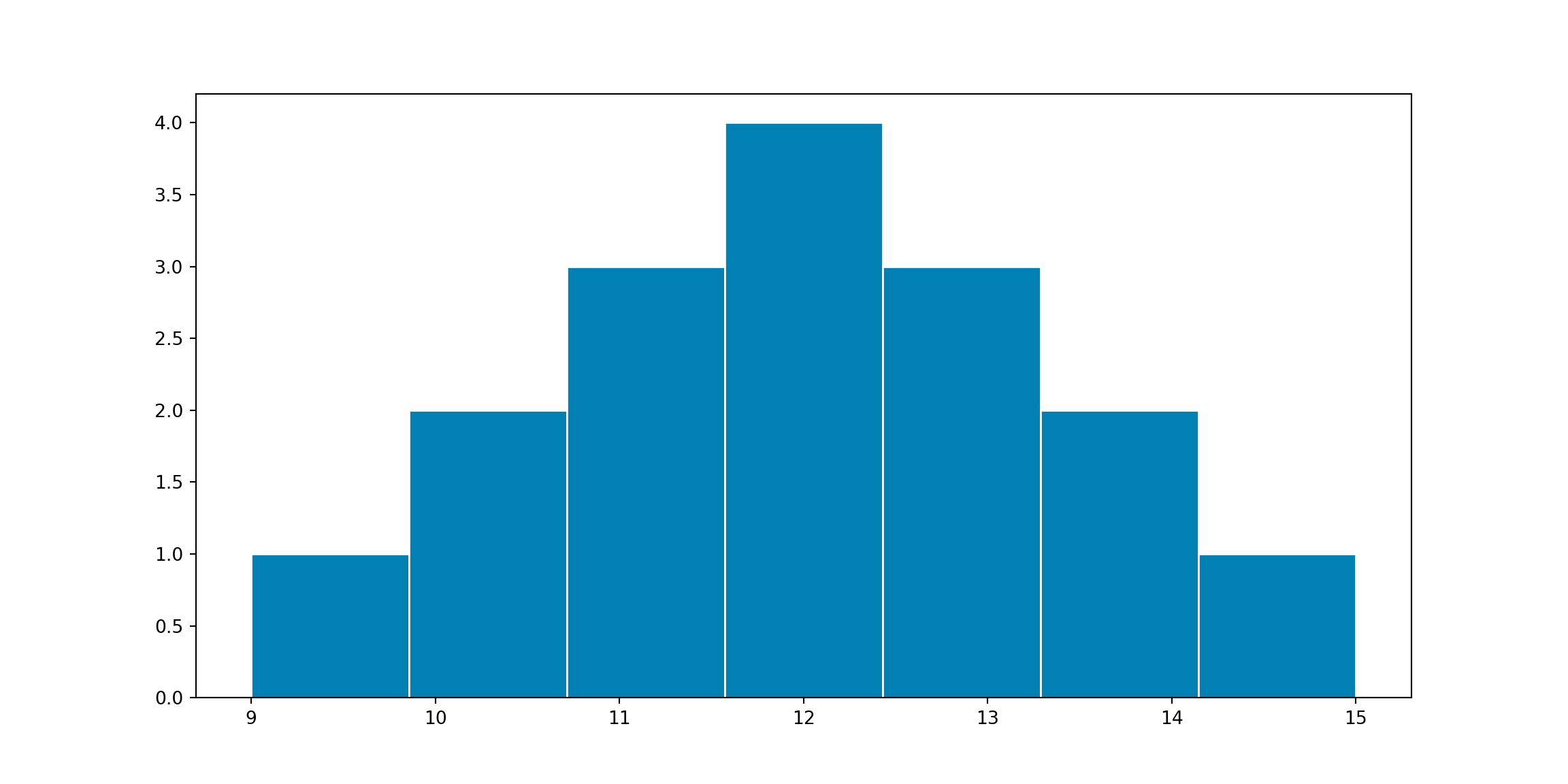
The width of each histogram bin represents a range of values from a lower limit up to but not including the upper limit. The height of each histogram bin represents the frequency or number of the values in that bin.
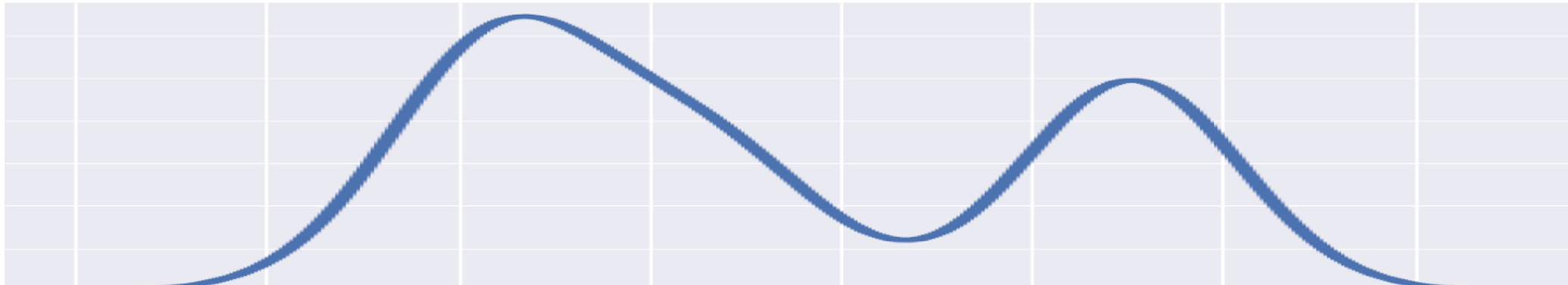
If we instead use the proportion of values in a histogram bin to present the height of the bin and use a curve to smoothen the histogram, the distribution of the data can be represented using a curve as follows:

The shape of a data distribution can be described using numerical measures such as skewness and kurtosis.
Skewness
Skewness is the measure of symmetry or asymmetry of a data distribution. A data distribution’s peak value (mode) can be used as a splitting point to split a distribution into two parts. If the two parts of the distribution are identical or similar, then the distribution is symmetrical. Otherwise, the distribution is asymmetrical.
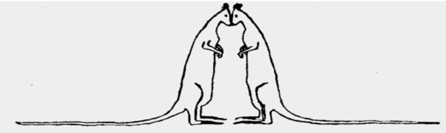
A symmetric distribution looks like the two identical kangaroos in the picture above. A symmetric distribution’s mean, median, and mode are approximately the same. A symmetric distribution with a bell shape is called a normal distribution.
An asymmetric distribution is skewed to the left or skewed to the right. A data distribution is right skewed when the tail of the distribution is longer on the right. A data distribution is left-skewed when the distribution has a longer tail on the left.
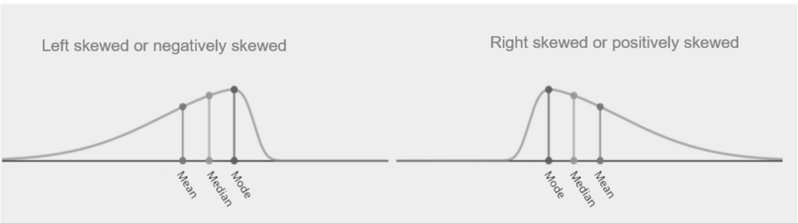
When data distribution is skewed, the median is a better measure of central location.
Kurtosis
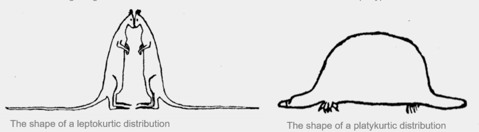
Kurtosis is the measure of the “thickness” of the tails of the distribution. The thicker the tails of the distribution, the higher the kurtosis of the distribution. A distribution with thinner tails compared to the tails of a normal distribution is called a leptokurtic distribution. A distribution with thicker tails compared to the tails of a normal distribution is called a platykurtic distribution. A platykurtic distribution looks like a platypus.
A distribution is approximately normal if the distribution’s kurtosis and skewness values are between -1 and 1; having mean and median values that are roughly the same. So, summary statistics such as mean, median, skewness and kurtosis can be used to check whether a distribution is normal.
A graphical approach, such as a visual inspection of a histogram, boxplot, or qqplot, could also be used to check the normality of the distribution of quantitative data. A data distribution’s normality plays an important role in statistical inference; hence, understanding how summary statistics are used to check for normality is essential. Describing data using summary statistics is a great starting point for data analysis and helps us better understand our data for further analysis.