Code
import pandas as pd
import numpy as np
from datetime import datetime, timedelta
import seaborn as sns
import matplotlib.pyplot as plt
Data exploration, also known as exploratory data analysis (EDA), involves examining a dataset’s structure, properties, distribution, and identifying relationships, patterns, and insights in the data.

Data exploration aims to gain a thorough understanding of the dataset, identify potential issues like missing values and outliers, uncover initial patterns and trends, and determine appropriate analytical techniques. Data exploration allows you to identify potential relationships in the data before diving into more complex analysis or modeling.
Summary statistics and visualization are two common ways of presenting the results of data exploration, as they help convey the distribution of variables in the dataset and the relationships among the variables.
Data exploration is about getting to know your data, and the methods below could be used to gain a thorough understanding of your data. Before we discuss the various data exploration techniques, let’s create some dataset that would be used to illustrate how these techniques work. A few records in the dataset are displayed below
Import the packages needed
import pandas as pd
import numpy as np
from datetime import datetime, timedelta
import seaborn as sns
import matplotlib.pyplot as pltCreate the Dataset
# set random seed
np.random.seed(1234)
# Generate date range from Jan 1 to Jan 15
date_range = pd.date_range(start="2025-01-01", end="2025-01-15")

# Randomly select 30 dates from the generated range
dates = np.random.choice(date_range, 30)

# Random unit prices between 10 and 100
unit_prices = np.random.uniform(10, 100, 30).round(2)
# Random quantity sold between 1 and 10
quantities_sold = np.random.normal(loc=10, scale=4, size=30)
# Total price (unit price * quantity sold)
total_prices = (unit_prices * quantities_sold).round(2)

# Create customer IDs and ages (4 unique customer IDs)
customer_ids = np.random.choice(["101", "102", "103", "104"], 30)
# Random customer age between 18 and 70
customer_ages = np.random.randint(18, 70, 30)

# Create product IDs (2 unique product IDs)
product_cat = np.random.choice(["A", "B"], 30)

# Create the DataFrame
df = pd.DataFrame({
    'date': dates,
    'cust_id': customer_ids,
    'cust_age': customer_ages,
    'product': product_cat,
    'quant_sold': quantities_sold,
    'tot_price': total_prices
})
# Sort the 'date' column in ascending order
df = df.sort_values(by='date')
# Display the dataframe
df.head().style.format({
                        'tot_price': '{:.2f}',
                        'quant_sold':'{:.0f}'
})| date | cust_id | cust_age | product | quant_sold | tot_price | |
|---|---|---|---|---|---|---|
| 20 | 2025-01-01 00:00:00 | 101 | 54 | B | 9 | 864.08 |
| 28 | 2025-01-01 00:00:00 | 104 | 52 | A | 16 | 918.02 |
| 23 | 2025-01-01 00:00:00 | 103 | 19 | A | 10 | 154.68 |
| 7 | 2025-01-02 00:00:00 | 101 | 33 | B | 14 | 1283.35 |
| 27 | 2025-01-03 00:00:00 | 101 | 56 | B | 11 | 685.14 |
Measures such as mean, median, and mode help determine the ‘central’ values in a dataset, while standard deviation and variance assess the spread or variability of the data. Skewness and kurtosis are statistical measures used to understand the shape and distribution of data.
numerical_df = df[['tot_price', 'cust_age', 'quant_sold']]
descriptive_stats = numerical_df.agg(['mean', 'median', 'max', 'min', 'std',
                                      'var', 'skew', 'kurt'])
descriptive_stats.style.format({
    'tot_price': '{:.2f}',
    'cust_age': '{:.2f}',
    'quant_sold': '{:.0f}'
})| tot_price | cust_age | quant_sold | |
|---|---|---|---|
| mean | 588.69 | 41.30 | 10 |
| median | 616.74 | 38.00 | 9 |
| max | 1460.68 | 67.00 | 20 |
| min | 27.15 | 18.00 | 2 |
| std | 361.78 | 13.45 | 4 |
| var | 130886.69 | 180.91 | 19 |
| skew | 0.39 | 0.28 | 0 |
| kurt | -0.21 | -0.63 | -0 |
Visualizing the distribution of both numerical and categorical data allows us to understand the structure of the data. This is also helpful in identifying outliers. By examining the structure of the data, we can make informed decisions about whether the data is suitable for further analysis.
Density plots, histograms, and boxplots can be used to visualize the distribution of numerical data, while bar graphs are useful for understanding the distribution of categorical data.
import pandas as pd
import seaborn as sns
import matplotlib.pyplot as plt

def plot_column_distributions(df):
  """
  Plots distributions of both numerical and categorical
  columns in a DataFrame using seaborn.
  """

  # Get column names and their data types
  all_cols = df.columns
  num_cols = df.select_dtypes(include=['float64', 'int64']).columns
  cat_cols = df.select_dtypes(include=['object', 'category']).columns

  # Calculate the number of rows and columns for the subplot grid
  num_plots = len(num_cols)
  cat_plots = len(cat_cols)
  total_plots = num_plots + cat_plots
  cols = 2  # Number of columns in the subplot grid
  rows = (total_plots + 1) // cols  # Calculate number of rows

  # Create subplots with side-by-side pairs
  fig, axes = plt.subplots(nrows=rows, ncols=cols, figsize=(12, 4*rows))

  # Plot distributions for each column
  idx = 0
  for i, col in enumerate(num_cols):
    sns.histplot(data=df, x=col, ax=axes[idx // cols][idx % cols], kde=True)
    axes[idx // cols][idx % cols].set_title(f'Distribution of {col}')
    idx += 1

  for i, col in enumerate(cat_cols):
    sns.countplot(data=df, x=col, hue=col, ax=axes[idx // cols][idx % cols], palette='Set2', legend=False)
    axes[idx // cols][idx % cols].set_title(f'Distribution of {col}')
    idx += 1

  # Remove any empty subplots
  for i in range(idx, rows * cols):
      fig.delaxes(axes[i // cols][i % cols])

  plt.tight_layout()
  plt.show()

# Example usage:
plot_column_distributions(df)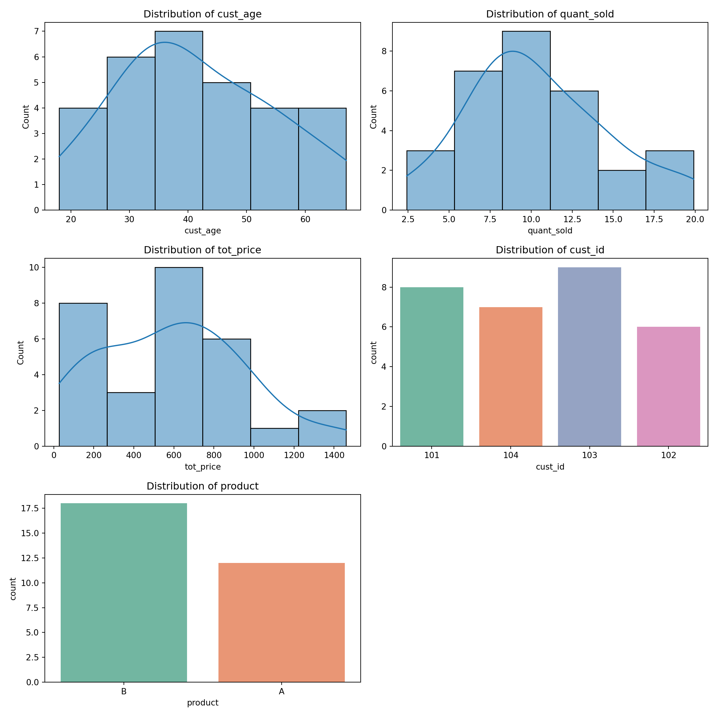
We can also explore the relationships between numerical variables using different types of plots:
Scatter plots: best for visualizing relationships between two variables
# Create the scatter plot
sns.scatterplot(x='quant_sold', y='tot_price', data=df, s=150)

# Set plot title and labels
plt.title('Scatter Plot: Quantity Sold vs Total Price', y=1.05)
plt.xlabel('Quantity Sold')
plt.ylabel('Total Price')

# Show the plot
plt.show()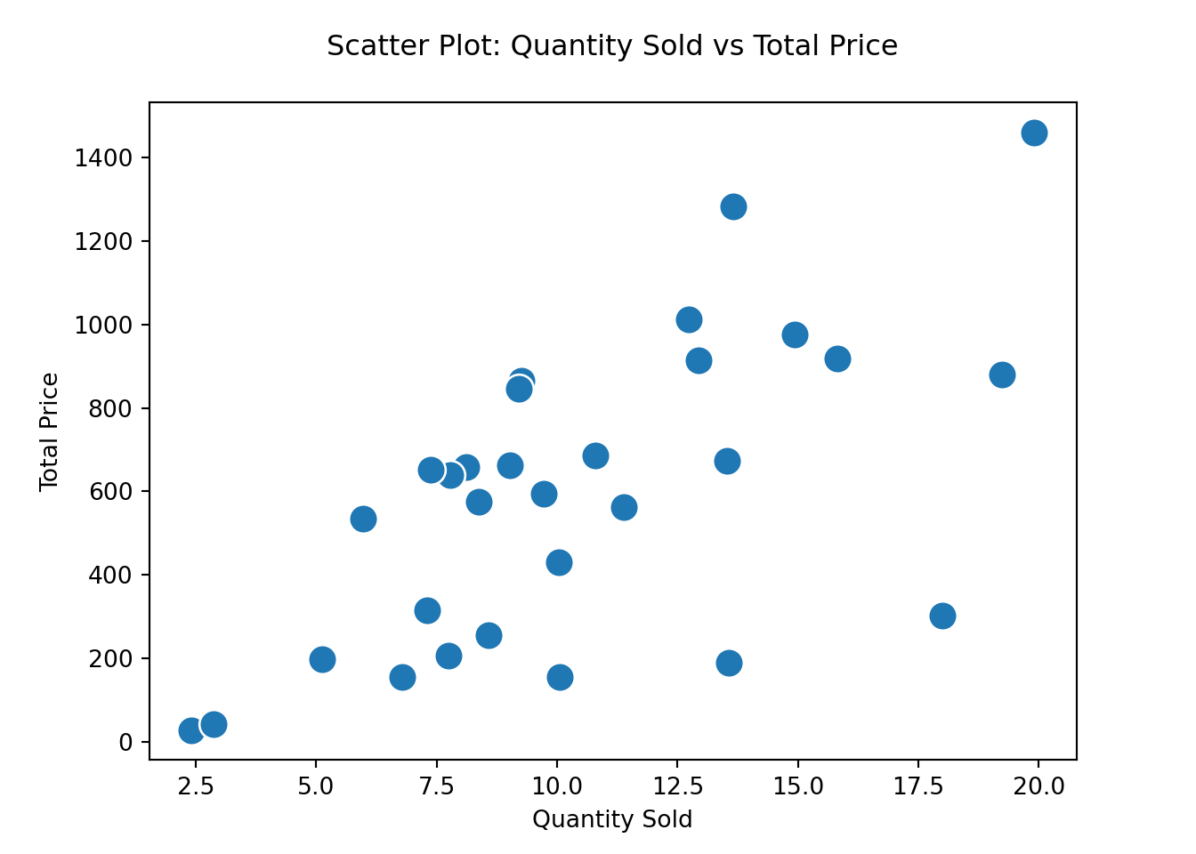
Pair plots: useful for exploring the correlations between multiple pairs of numerical variables at once.
# Create the pair plot
sns.pairplot(df);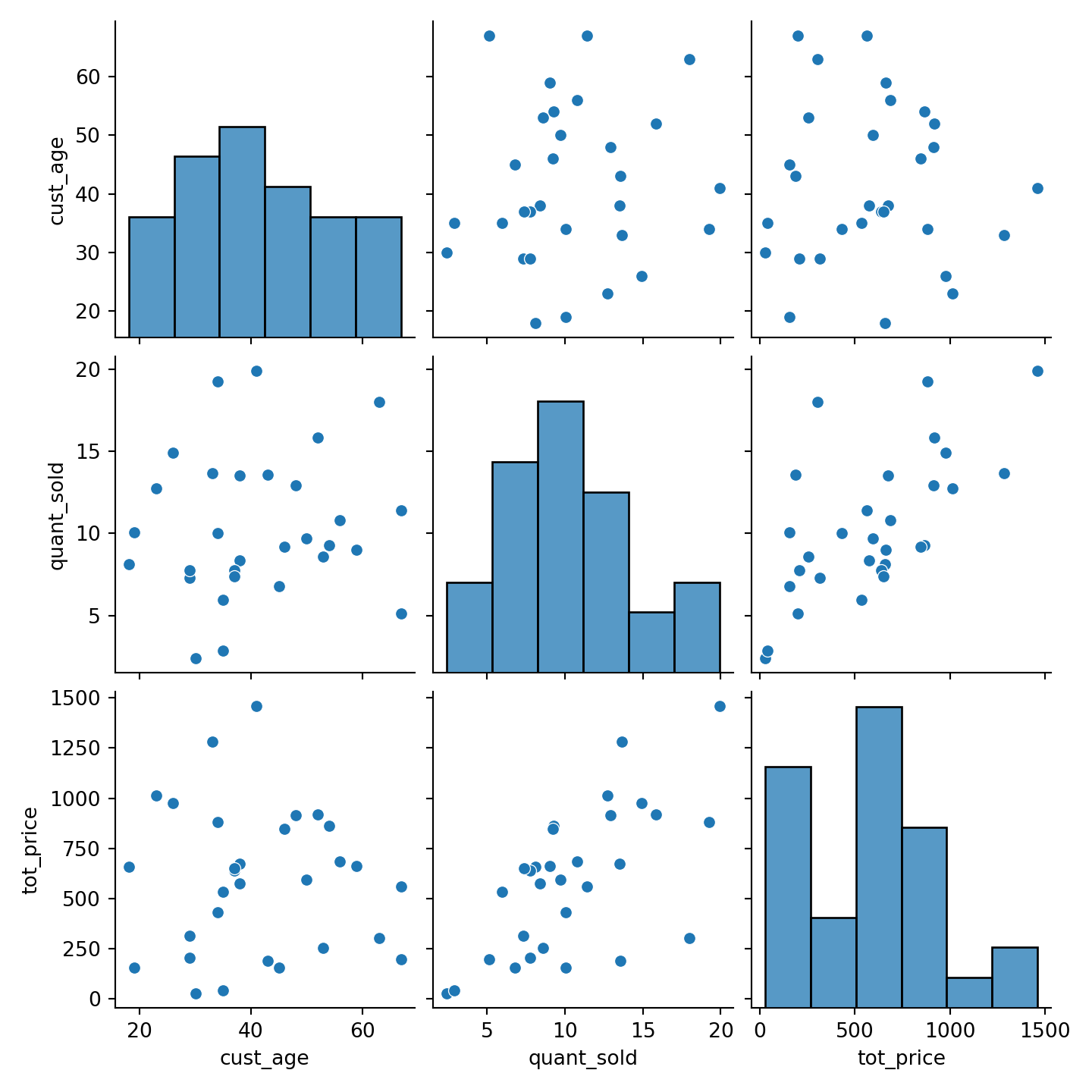
Correlation heatmaps: help to quickly visualize pairwise correlations
# Compute the correlation matrix
numerical_df = df[['tot_price', 'cust_age', 'quant_sold']]
correlation_matrix = numerical_df.corr()

# Create the heatmap
sns.heatmap(correlation_matrix, annot=True, cmap='coolwarm', fmt='.2f', vmin=-1, vmax=1)

# Set the plot title
plt.title('Correlation Heatmap')

# Show the plot
plt.show()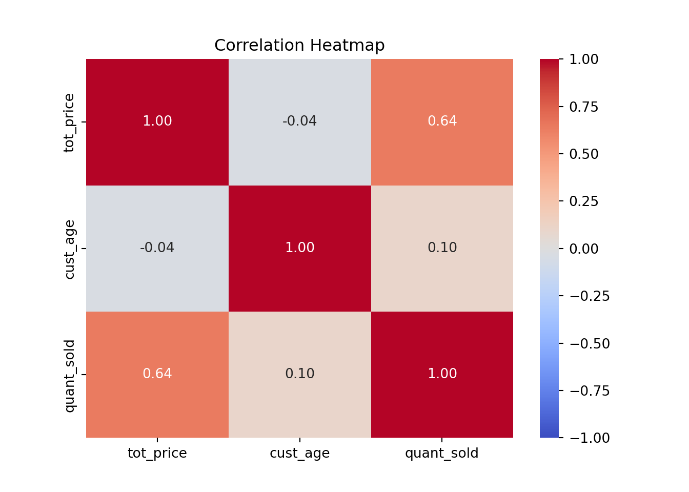
Regression plots, which are used for visualizing linear relationships and trends
# Create the regression plot
sns.regplot(x='cust_age', y='tot_price', data=df)

# Set plot title and labels
plt.title('Regression Plot: Customer Age vs Total Price')
plt.xlabel('Customer Age')
plt.ylabel('Total Price')

# Show the plot
plt.show()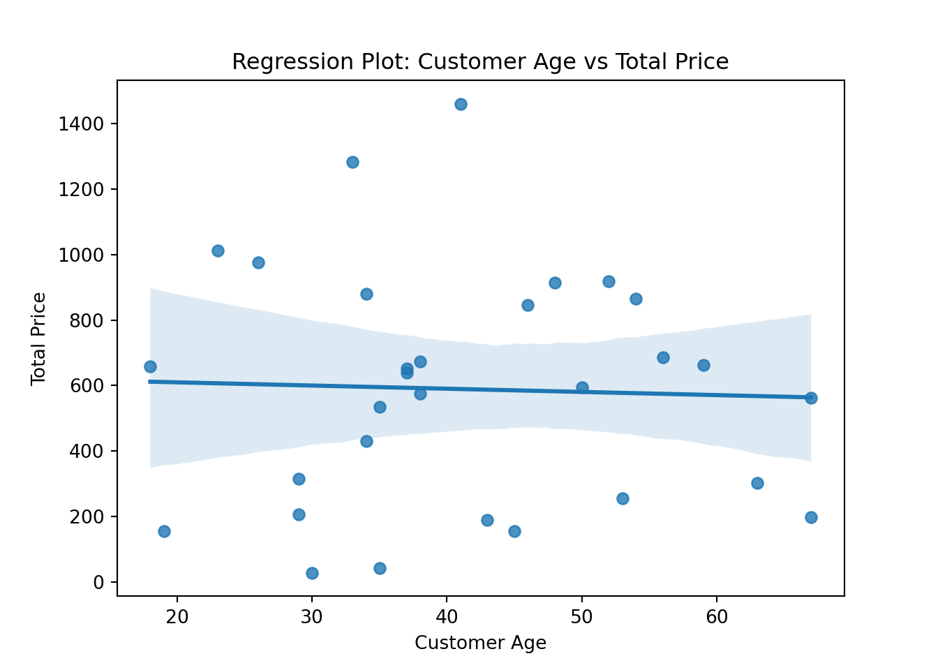
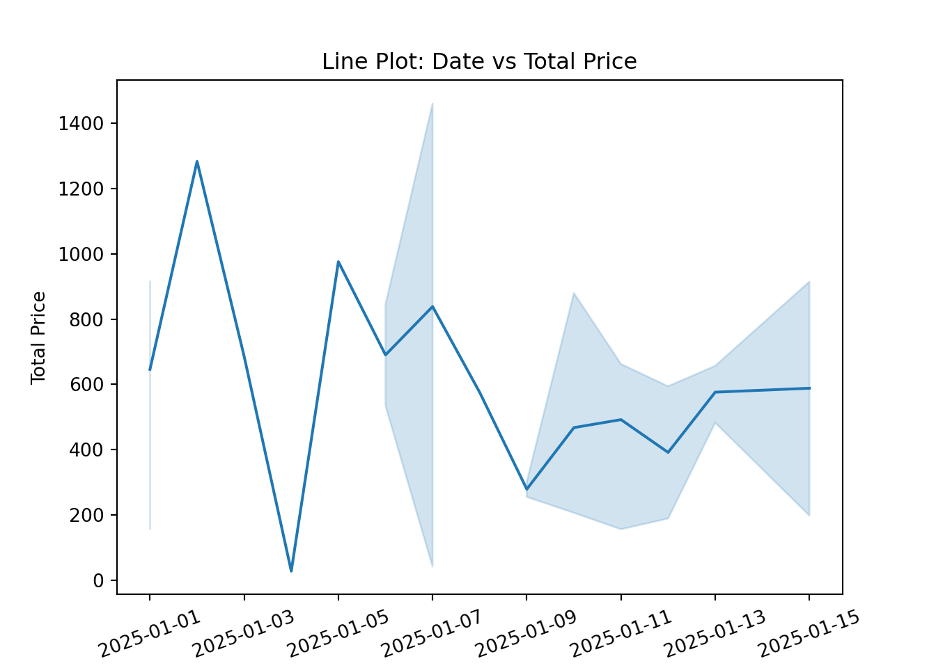
line plots: useful for showing trends over time.
# Create the line plot
ax = sns.lineplot(x='date', y='tot_price', data=df)

# Rotate the date labels directly using the Axes object
ax.set_xticklabels(ax.get_xticklabels(), rotation=20)

# Set the plot title and labels
ax.set_title('Line Plot: Date vs Total Price')
ax.set_xlabel('Date')
ax.set_ylabel('Total Price')